Web Development
Service Pages That Answer Buyers’ Questions: Price Signals, Process, Proof and the Next Step
Visitors scan a service or product page for four things: roughly what it costs, how it works, whether people like them have used it, and what happens next. Here is how we structure pages so they find all four, with a furniture retailer as the worked example.

Watch someone use a service page and you see the same thing almost every time. They scroll past the opening paragraph looking for four things: roughly what it costs, how it works, whether anyone like them has used it, and what happens if they get in touch. If the page answers those, they act. If it does not, they open a competitor in a new tab, or send an email asking the questions the page should have answered.
Our website design service spends more time on the structure of service and product pages than on any other part of a site, because that is where buying decisions are made, whether on a service business's site or on product pages in a store our eCommerce team builds. Here is the structure we use, with a furniture retailer as the worked example.
Lead With What It Is and Who It Is For
The first screen should say in one sentence what the service or product is and who it is for, and offer the main action. Not a slogan, not the company history. A plain line such as "made-to-order sofas in your choice of size and fabric" tells a furniture buyer more than "comfort, crafted for you" ever will.
Below that, the page should make sense from its headings alone. Someone who reads only the headings should come away with an answer to all four questions. It is a test you can run on your own site today: read only the headings of your most important page and see what they tell you.
Give a Price Signal, Even if You Cannot Give a Price
Many businesses leave prices off service pages because every job is different. The visitor does not need an exact figure. They need to know whether they are in the right range before spending time on a conversation, and without any signal many assume the worst and leave. There are several honest ways to give one:
- A starting point. A "from" price, or a typical range for a typical job.
- What changes the price. A short list of the factors that make it more or less: size, materials, quantity, urgency, location.
- Worked examples. Two or three example jobs with what they included, clearly labelled as examples.
- Packages. Where the work genuinely falls into tiers, show the tiers.
- A calculator. Where pricing follows clear rules, a simple estimator or configurator.
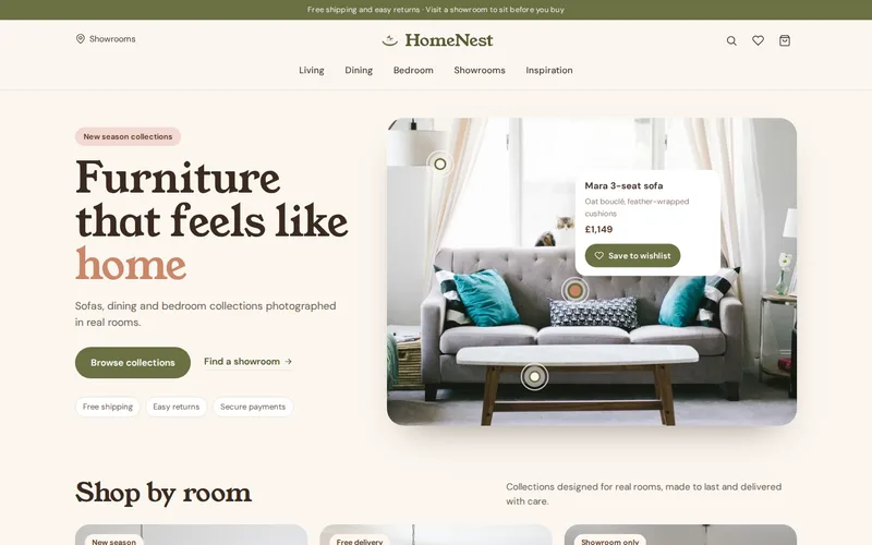
Even "most projects like this fall between X and Y" filters out people who were never going to buy and reassures those who were. For retailers, price belongs near the top, beside the product name. On the HomeNest furniture website, key information such as price, materials and delivery sits close to the top of each product page rather than below long blocks of text, because that is what people scroll looking for.
Explain the Process in Steps
Uncertainty about what happens next is a quiet reason people do not enquire. A numbered process of four to six steps, each with one sentence and an idea of timing, removes it: what happens after they get in touch, when they will hear back, when they pay, how long until delivery or completion, and what they need to do themselves.
Be specific where you can. "We reply within one working day" reassures more than "we'll be in touch soon". If there is a step customers often worry about, such as a survey, a deposit or a long lead time, say so plainly rather than leaving them to discover it later.
Put Proof Next to the Claim It Supports
Most sites gather proof on a testimonials page that nobody visits. Proof works where the doubt arises. A claim about careful delivery should sit beside a review that mentions delivery. A claim about sector experience should link to a project in that sector. A guarantee should be stated next to the button, not in the footer.
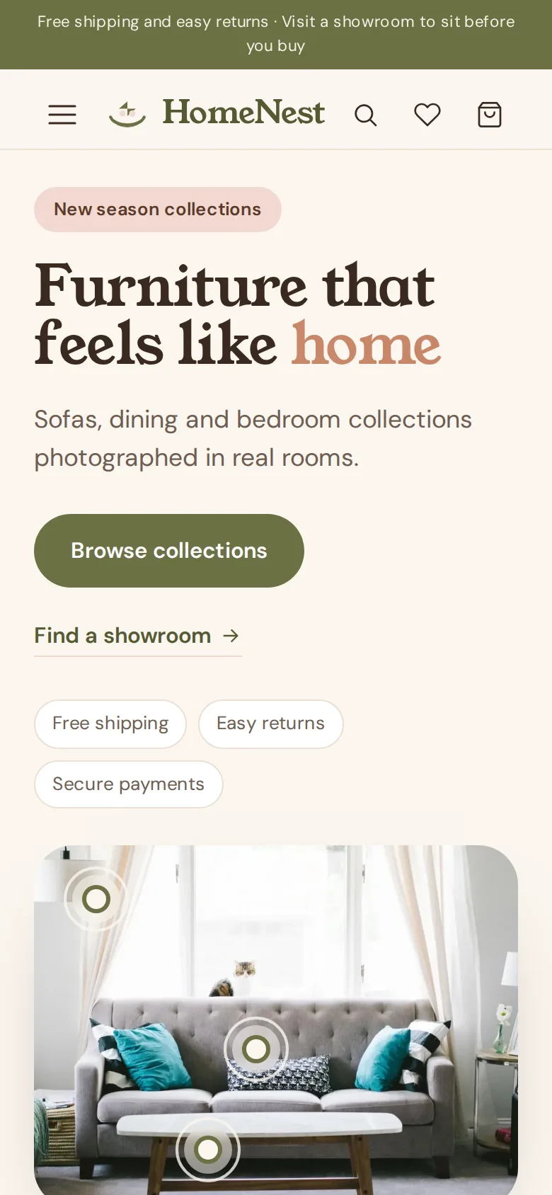
HomeNest illustrates this well: trust signals such as free shipping, easy returns, secure payment and showroom details are placed near the calls to action, where customers decide, rather than hidden at the bottom of the page. The same principle works for a service business: accreditations beside the booking form, a short case study on each service page, real photographs of real work.
Answer the Questions Your Inbox Already Gets
The best source of content for a service page is the email you receive from people who read it and still had to ask. Collect those questions for a month. Most will be variations on a handful: lead times, what is included, what happens if something goes wrong, whether you cover their area, what they need to prepare. Answer each in a short FAQ section on the relevant page, in the words customers use.
This helps search too. Pages that answer specific questions clearly match the specific searches people make, and with the right markup those answers can appear in results. Our technical SEO service handles the structured data; the content has to come first.
Match the Next Step to How Ready They Are
Not everyone reading a service page is ready to ask for a quote. Offering only "Get a quote" loses the people who are still deciding. A good page offers a main action and a softer one:
- Ready: buy, book, or request a quote with a short form.
- Nearly ready: book a call, visit a showroom, order samples.
- Still researching: download a guide, see a price list, read a related project.
Keep forms short. Ask only for what you need to reply usefully, and say what happens after someone presses send and how quickly.
A Furniture Example, Section by Section
To make this concrete, here is how we would structure a page for a hypothetical made-to-order sofa service on a furniture retailer's site:
- Opening: one sentence on what it is, a lifestyle photograph, a "from" price and two buttons: "Design your sofa" and "Order fabric samples".
- Price signals: a short table of sizes with starting prices, and what changes the price: size, fabric grade, cushion filling.
- Process: choose, sample, order with a deposit, production, delivery, each with its timing.
- Proof: reviews that mention build quality and delivery, a photograph of the workshop, the guarantee beside the order button.
- Practical details: dimensions, delivery access, returns on made-to-order items, care.
- FAQs: the six questions showroom staff are asked most.
- Next step: the main and softer actions repeated, plus showroom details for people who want to sit on it first.
Every section answers a question a buyer would otherwise have to ask. That is the whole method.
Check Your Own Pages
Pick your three most important service or product pages and check each for a price signal, a process, proof beside claims, real FAQs and a next step for people who are not ready yet. Pages missing two or more are worth reworking before any wider redesign. The checks in our article on website design that converts cover the rest of the site, and when the structure needs building into a theme your team can edit, our WordPress team does that. For an outside view, send us the address of your most important service page and we will tell you which of the four questions it leaves unanswered.
Frequently Asked Questions
Should we show prices if every job is quoted individually?
Show a signal rather than a price. A typical range, a starting point or two worked examples, together with a list of what makes a job cost more or less, lets visitors judge whether you are within their budget without committing you to a figure. Pages that say nothing about cost tend to attract fewer enquiries and less suitable ones.
How long should a service page be?
As long as it takes to answer the main questions, and no longer. For a simple service that may be a few hundred words; for a complex or expensive one it can be much more. Length matters less than structure: clear headings, the key facts near the top and sections a visitor can jump straight to.
Is it better to have one services page or a separate page for each service?
A page for each distinct service is almost always better, for visitors and for search. Each page can answer the questions specific to that service, carry relevant proof and match the searches people actually make for it. A short overview page linking to them helps visitors who are not sure which one they need.
Where should testimonials go on a service page?
Close to the claims they support and near the main call to action, rather than on a separate page. A review that mentions punctual delivery belongs beside the delivery information; a review praising a particular service belongs on that service’s page. Short extracts with a name and some context work better than long, generic praise.
How do we know whether our service pages are working?
Track the actions each page is meant to produce, such as enquiries, bookings, sample orders or add-to-basket clicks, and compare them before and after changes. Also listen to the questions that still arrive by phone and email: if people keep asking something the page should answer, it needs another section.