A modern, fully responsive website for a home furniture brand, designed to showcase products beautifully on every device.
View live demo Opens a working demo with sample content in a new tab.
On location
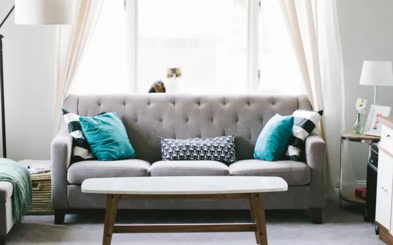
House InteriorPhoto: Nathan Fertig (CC0)
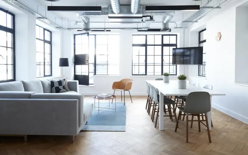
Interior DesignPhoto: Breather (CC0)
Modern InteriorPhoto: Dahl House Design (CC0)
Interior DiningPhoto: Kristin Hardwick (CC0)
Interior DesignPhoto: Kristin Hardwick (CC0)
About the Project
HomeNest is a furniture website design project for a home furniture brand whose collections are calm, modern and built around real rooms. The brief was simple to say and harder to deliver: make the website feel like the furniture. That meant generous photography, an unhurried layout and copy that helps people picture a sofa or a dining table in their own home, while still guiding them clearly towards a showroom visit or a purchase.
We designed and built a responsive furniture website on WordPress with a custom theme, starting from the smallest screen and working up. Many HomeNest customers browse collections on a phone in the evening and visit a showroom at the weekend, so the mobile experience could not be a cut-down version of the desktop site. The finished site carries the same brand experience across desktop, laptop, tablet and mobile, with clear calls to action and trust signals on every key page.
About the Client
HomeNest sells sofas, dining furniture and bedroom collections, photographed in real rooms rather than on white backgrounds. The brand’s customers are furnishing a home they care about, so they compare carefully, look for reassurance on delivery and returns, and often want to see and sit on a piece before buying.
The marketing team needed a website they could keep fresh themselves: new collections each season, inspiration content and a blog that supports search. A site that looked beautiful on launch day but needed a developer for every new product page would not have served them for long.
Project Goals
Reflect the calm, modern style of the collections in every part of the design.
Work flawlessly on phones and tablets, where many customers start browsing.
Make trust signals such as delivery, returns and secure payment visible at the moment of decision.
Keep pages fast despite large, high-quality furniture photography.
Give the team an easy content structure for new collections and blog posts.
Project Overview
The Challenge and Our Solution
The Challenge
HomeNest wanted a fresh online presence that reflected the calm, modern style of its furniture collections and worked flawlessly for the many customers browsing on phones and tablets.
Our Solution
We created a light, spacious design system with generous imagery, clear typography and prominent trust signals such as free shipping, easy returns and secure payments. The site was built mobile-first, with optimised images and a simple navigation structure for products, services, projects and blog content.
A Design System Built Around Real Rooms
We started with a light, spacious design system: a warm neutral palette, clear typography and plenty of white space so the photography carries the page. Collections are presented room by room, which matches how people actually shop for furniture — they are furnishing a living room or a bedroom, not browsing a list of product types.
Every component, from collection cards to product galleries and inspiration blocks, was designed once and reused, so new pages stay consistent with the brand without design effort each time.
Room-led navigation for living, dining and bedroom
Reusable components that keep every page on-brand
Photography-first layouts with generous spacing
Mobile-First, Not Mobile-Afterwards
The responsive furniture website was designed for the phone first. Navigation collapses into a simple menu, product images can be swiped, and key information such as price, materials and delivery sits close to the top of each page rather than below long blocks of text.
On larger screens the same layouts open up into wider galleries and side-by-side detail, so a customer who discovered a sofa on the train can pick up the same journey on a laptop at home without relearning the site.
Layouts that adapt gracefully from desktop to small phones
Swipeable galleries and thumb-friendly controls
Essential product details placed high on the page
Product Storytelling and Trust
Furniture is a considered purchase, so the copy and imagery work together to help customers picture each piece at home: lifestyle shots, material close-ups and short descriptions that explain how a product feels and how it is made, rather than lists of dimensions alone.
Trust and conversion elements — free shipping, easy returns, secure payments and showroom details — are placed where customers need them, near calls to action instead of hidden in the footer. That reassurance matters most at the point someone is deciding whether to commit.
Lifestyle imagery and concise, sensory product copy
Delivery, returns and payment assurances beside the buy decision
Clear routes to a showroom visit
Fast Pages and an SEO-Ready Structure
High-quality furniture photography can make a site slow. We optimised and served responsive images so each device downloads only the size it needs, which keeps pages fast on mobile connections without compromising how the collections look.
Behind the design sits an SEO-ready structure: semantic headings, descriptive metadata, clean URLs and an organised hierarchy of collections, products, services, projects and blog content. The custom WordPress theme lets the team publish new collections and articles that inherit that structure automatically.
Responsive, optimised imagery for quick loading
Semantic headings, metadata and clean URLs
An easy-to-update content model for collections and posts
Our Process
How We Delivered It
1
Brand and Audience Review
We looked at the collections, the showroom experience and how customers browse, to define what the website needed to feel like.
2
Mobile-First Wireframes
Key journeys — finding a collection, viewing a product, booking a showroom visit — were wireframed for the phone before anything else.
3
Visual Design System
Typography, colour, spacing and components were designed as a system so every page could share them.
4
Custom WordPress Build
We built the custom theme with optimised images and a content structure the team can manage without code.
5
Device Testing and Launch
Pages were tested across phones, tablets, laptops and desktops before launch, with speed and accessibility checks.
Key Features
What We Delivered
Mobile-First Responsive Design
Layouts that adapt gracefully from large desktop screens to small phones.
Product Storytelling
Lifestyle imagery and concise copy that help customers picture products at home.
Trust & Conversion Elements
Shipping, returns and payment assurances placed where customers need them.
SEO-Ready Structure
Semantic headings, descriptive metadata and clean URLs for search visibility.
Outcome
Results and Impact
A consistent brand experience across desktop, laptop, tablet and mobile.
Clear calls to action and trust signals on every key page.
Fast-loading pages thanks to optimised, responsive imagery.
An easy-to-update content structure for new collections and blog posts.
Client Feedback
What the Client Says
★★★★★
Beautiful on a phone, which is where most of our visitors are.
Marketing ManagerHomeNest
Services
Services Behind This Project
The Website Design, WordPress expertise we used to build this website design & development — and can bring to yours.
Custom WordPress themes, plugins and WooCommerce builds that are fast, secure and genuinely easy for your team to manage.
Learn more
FAQ
Frequently Asked Questions
What makes a good furniture website design?
A good furniture website lets the products breathe. Large, well-lit photography, room-based navigation and short, sensory descriptions help customers imagine a piece at home. Just as important are practical details — dimensions, materials, delivery and returns — placed close to the buy button, and a mobile experience that is as complete as the desktop one.
Why build mobile-first for a furniture brand?
Many people discover furniture on their phones, often in the evening or while travelling, and then visit a showroom or buy later on a larger screen. Designing for the phone first makes sure the most important information and actions are never squeezed out, and the desktop site then becomes a richer version of a journey that already works.
Can we update collections and blog posts ourselves?
Yes. A custom WordPress theme can be built so that new collections, products, inspiration pages and blog posts use ready-made layouts. Your team adds images and copy, and the design, headings and metadata follow the same structure every time, so the site stays consistent without needing a developer for routine updates.
How do you keep image-heavy pages fast?
Images are compressed, served in modern formats and generated at several sizes so each device downloads only what it needs. Pages load images just before they come into view, and the layout reserves space for them so nothing jumps around. The result is a photography-led site that still feels quick on a mobile connection.
Should a furniture website sell online or drive showroom visits?
It depends on your products and margins, and many brands do both. Even without online checkout, a site can make showroom visits easy to plan, collect enquiries and show stock or delivery information. We usually design so that adding eCommerce later is a natural next step rather than a rebuild.
How long does a responsive furniture website take to build?
Timelines depend mostly on the number of page types, the amount of content and photography ready at the start, and any integrations such as stock or booking systems. A focused brand site with a handful of templates moves much faster than a large catalogue with complex product data, so we agree scope and milestones before design begins.
Similar Work
Related Projects
Case studies built with the same technologies or for similar needs.